CLIENT: ALHAVI Pharmaceutical Co.
SERVICES: Branding, Packaging
About
ALHAVI Pharmaceutical Co.
Alhavi Pharmaceutical Company was founded in May 1968 under the name of “park Davis” in an area about 22000 square meters located in 12th of Karaj Road and renamed to Alhavi in 1982.
The name of this company is derived from the book “Alhavi Fi-al-Teb” written by Zakaria Razi. RAZI spent 15 years of his life on writing this book and lost his eyes on this path. The book is translated into English in 15 volumes and kept in Vatican.
Alhavi Co. striving to improve the healthcare of the community by means of taking advantages of new technologies in accordance with international standard.
logo evolution of ALHAVI Pharma

MOODBORADS
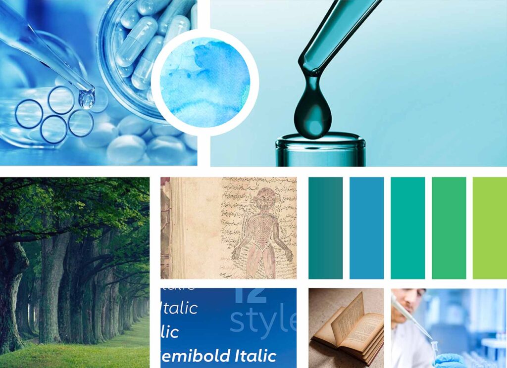
Moodboard is an ideal first step to make sure we are on the same page with our clients and understand the soul and emotion of their brand. To explore the right visual rythm for a future identity, we dig lots of refrences. Afterwards, we group our findings for example, collection of colors, images, fonts and even textures that define what the project is about.
Moodborad is a tool for designer and client to come to an agreement about style of brand.
Here you can see our moodboard:

Key Stage:
Sketches
Key Words
BOOK
DROP
PHARMACEUTICAL
TURQUOISE
SNAKE
Exploration & Logo Component
We had two elements in the old logo:
1. A book “Alhavi Fi-al-Teb” written by Razi that also refers to company’s name
2. A drop that is symbol of extract
The logo has created in 1968 is probably not going to speak to customers in 2018 so we consider the current design elements that are representing Alhavi Company successfully and then we removed extra lines, types and also modernized the elements by designing a new style of merging of book and drop.

Logo Design Process
protective space are around the logo to maintain visual clarity and to provide maximum impact. To protect the integrity of the logo, this space is required around all sides of the logo.
Colors palette
Color palette is one of the most impactful choices that can highlight your business’ strengths and help you attract the right customers.
We have chosen three primary colors: Green, Blue and Lime
1. Green: connection to nature
2. Blue: symbolizing trustworthiness and maturity
3. Iime: cheerful, affordable and youthful energy.

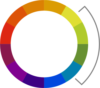
Analogous colors
We choosed Analogous colors fall close to each other on the wheel that have harmonious together.


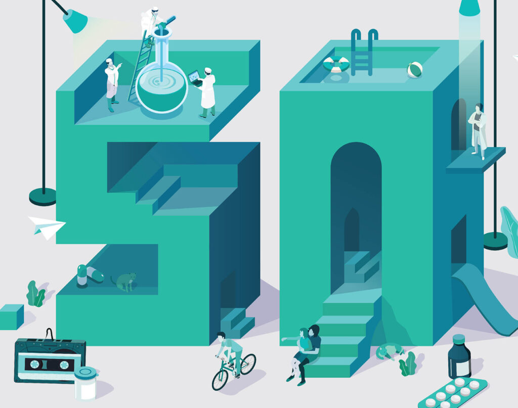
Poster Design
50th Anniversary of ALHAVI Pharma

